
Helping Wilbur look as good as it tastes
Wilbur’s photography was dated, consisting mostly of products shot against plain white. We helped them get into the rhythm of regular photo shoots throughout the year, building a deep library of lifestyle and product photography for our teams to draw on.
Helping Wilbur look as good as it tastes
Wilbur’s photography was dated, consisting mostly of products shot against plain white. We helped them get into the rhythm of regular photo shoots throughout the year, building a deep library of lifestyle and product photography for our teams to draw on.
Less Salesy,
More Social
Social media was another opportunity for Wilbur to better engage with younger audiences. We helped them shift their focus from sales and announcements to the traditions and fan loyalty that make Wilbur special.


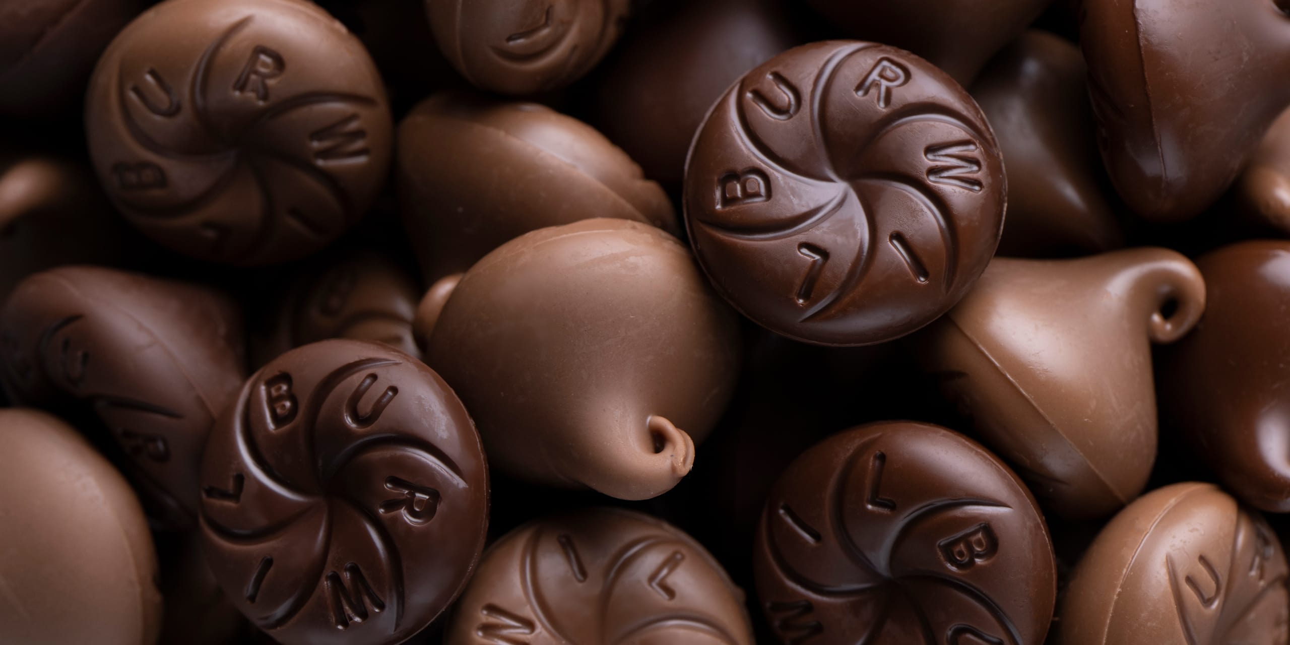
A new logo for an American original
Wilbur wanted to update the branding of their Buds to mark the candy’s 125th year. As our teams went through the visual language workshop together, we settled on a visual direction evoking timeless craft. After presenting several options and landing on a final logo, we incorporated the new identity across a range of materials.

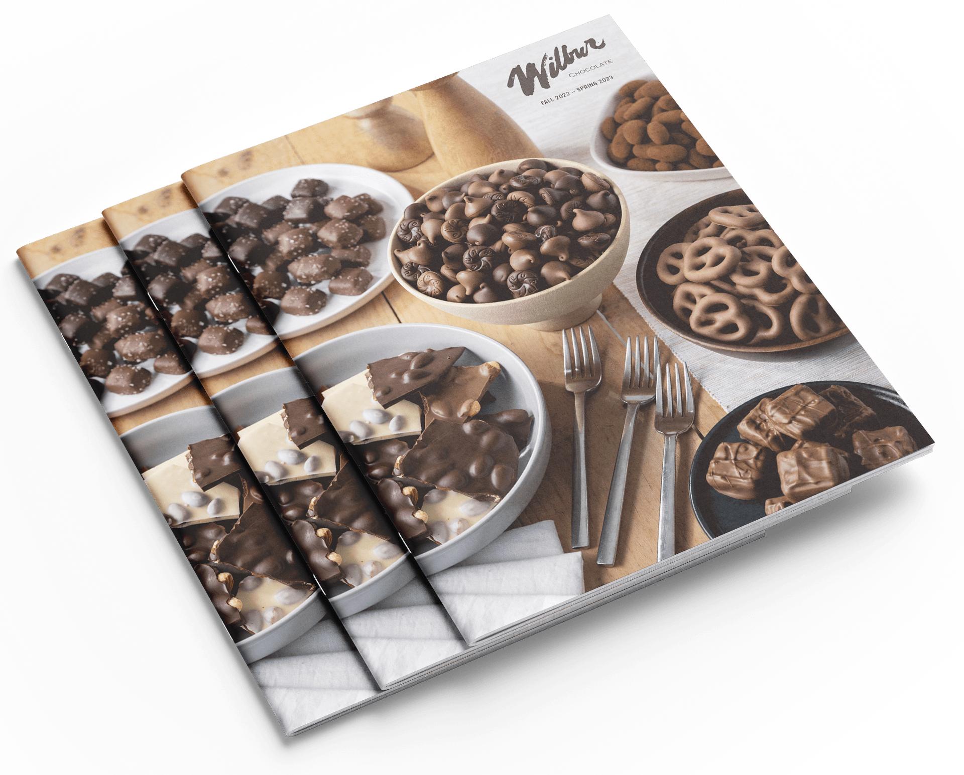
Sweet & Tidy
Even in the age of online shopping, Wilbur’s holiday catalog continues to drive an impressive number of orders each year. Over the last few years, we’ve helped Wilbur incorporate beautiful photography and more thoughtful layouts that guide shoppers through hundreds of mouth-watering products–and make the ordering process clear, organized, and simple.
